
Mar 13, 2024
Part 5: C.O.S in the Field - From Theory to Practice
Part 5: C.O.S in the Field - From Theory to Practice
Part 5: C.O.S in the Field - From Theory to Practice

Tommy Reznyk - Creative Art Director & Designer
Real-World Applications of C.O.S
The Colour Onion System transcends theory, proving its value in diverse design projects. This section illustrates how C.O.S effectively shapes design outcomes.
Branding with C.O.S
In branding, C.O.S integrates crucial elements to develop strong brand identities:
Colour Selection: Choosing colours that reflect the brand's ethos.
Style Application: Defining styles that align with the brand's personality.
Ratio Balancing: Using colour ratios to ensure material consistency.
Feedback Incorporation: Refining designs based on stakeholder feedback.
Medium Adaptation: Adjusting designs for both digital and print mediums.
C.O.S in UI Development
C.O.S enhances digital UI design through:
Strategic Colour Choices: Influencing user experience with colour.
Flexible Styles: Creating intuitive and cohesive UI elements.
Ratio for Usability: Employing colour ratios to enhance usability and accessibility.
Editorial Design with C.O.S
In print media like magazines, C.O.S guides:
Harmonious Colour Use: Setting the publication's mood with colour and style choices.
Balanced Visuals: Ensuring colour ratios complement the content.
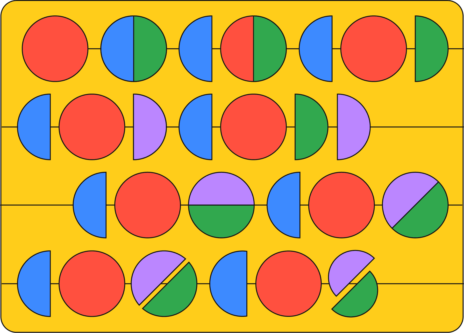
COS's Event Identity
This part of the series illustrates the application of the Colour Onion System in creating a visual identity for the C.O.S, focusing on the nuanced process of colour ratio determination and team collaboration.
1. Initial Concept and Colour Selection
Colour Palette: The venture initiates with the Colour Onion System's colour palette, laying the groundwork for the event's visual identity. This palette not only defines the aesthetic but also embodies the event's ethos, ensuring a coherent visual narrative.
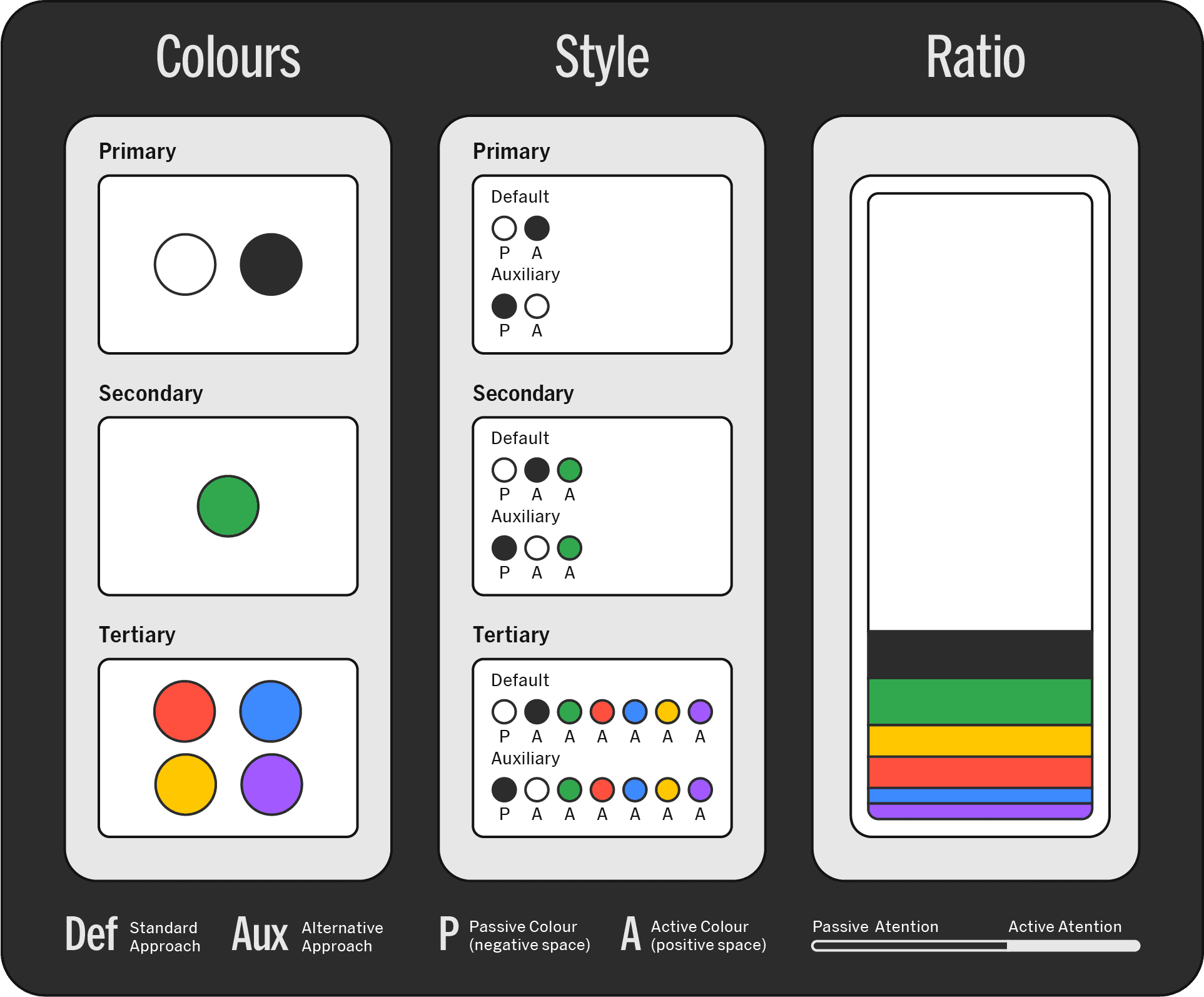
2. Styles and Aesthetic Definition
Applying Styles: The application of C.O.S styles brings the event's dynamic essence to life, infusing each design element with the system's versatile and adaptive character.
Customized Styles: C.O.S allows for the customization of styles to meet the specific branding requirements of the event, ensuring that the visual identity is not only unique but also resonates with the intended audience.
3. Ratio Process: Balancing Colours Intuitively
Estimating Initial Ratios: Design initiation involves estimating colour ratios with the help of the Ratio Ruler and Ratio Grid. These tools facilitate a simultaneous approach to determining colour percentages and can also serve as a foundational grid for layout design, ensuring that colour balance and spatial arrangement go hand in hand.
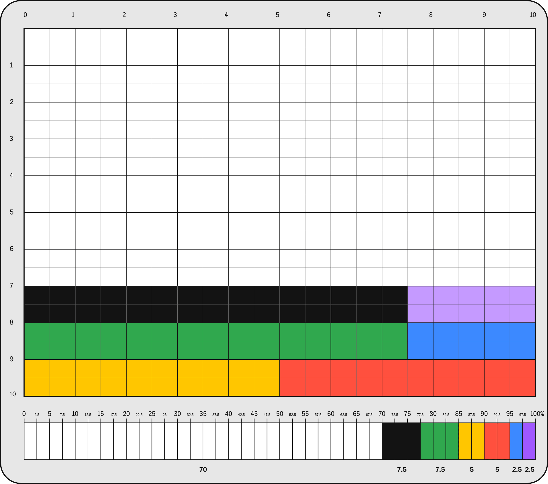
Iterative Refinement: The design undergoes continuous refinement, with adjustments based on stakeholder feedback and a deepening understanding of the project's visual requirements. This iterative process fine-tunes the colour balance to an optimal ratio.
Leveraging Saved Profiles: To achieve consistency across the team, C.O.S encourages the use of pre-approved Ratio Ruler profiles as standard guidelines. This practice fosters a unified design approach, crucial in collaborative efforts to ensure a seamless visual language throughout the project.
4. Feedback and Iterative Design
Responsive Adjustments: Stakeholder feedback guides continuous refinements, ensuring the design meets both aesthetic and functional goals.

5. Medium-Specific Design Adaptation
Adapting Across Formats: The final design is adapted for various mediums, ensuring colour consistency and visual impact across digital and physical platforms.
Real-World Applications of C.O.S
The Colour Onion System transcends theory, proving its value in diverse design projects. This section illustrates how C.O.S effectively shapes design outcomes.
Branding with C.O.S
In branding, C.O.S integrates crucial elements to develop strong brand identities:
Colour Selection: Choosing colours that reflect the brand's ethos.
Style Application: Defining styles that align with the brand's personality.
Ratio Balancing: Using colour ratios to ensure material consistency.
Feedback Incorporation: Refining designs based on stakeholder feedback.
Medium Adaptation: Adjusting designs for both digital and print mediums.
C.O.S in UI Development
C.O.S enhances digital UI design through:
Strategic Colour Choices: Influencing user experience with colour.
Flexible Styles: Creating intuitive and cohesive UI elements.
Ratio for Usability: Employing colour ratios to enhance usability and accessibility.
Editorial Design with C.O.S
In print media like magazines, C.O.S guides:
Harmonious Colour Use: Setting the publication's mood with colour and style choices.
Balanced Visuals: Ensuring colour ratios complement the content.
COS's Event Identity
This part of the series illustrates the application of the Colour Onion System in creating a visual identity for the C.O.S, focusing on the nuanced process of colour ratio determination and team collaboration.
1. Initial Concept and Colour Selection
Colour Palette: The venture initiates with the Colour Onion System's colour palette, laying the groundwork for the event's visual identity. This palette not only defines the aesthetic but also embodies the event's ethos, ensuring a coherent visual narrative.
2. Styles and Aesthetic Definition
Applying Styles: The application of C.O.S styles brings the event's dynamic essence to life, infusing each design element with the system's versatile and adaptive character.
Customized Styles: C.O.S allows for the customization of styles to meet the specific branding requirements of the event, ensuring that the visual identity is not only unique but also resonates with the intended audience.
3. Ratio Process: Balancing Colours Intuitively
Estimating Initial Ratios: Design initiation involves estimating colour ratios with the help of the Ratio Ruler and Ratio Grid. These tools facilitate a simultaneous approach to determining colour percentages and can also serve as a foundational grid for layout design, ensuring that colour balance and spatial arrangement go hand in hand.
Iterative Refinement: The design undergoes continuous refinement, with adjustments based on stakeholder feedback and a deepening understanding of the project's visual requirements. This iterative process fine-tunes the colour balance to an optimal ratio.
Leveraging Saved Profiles: To achieve consistency across the team, C.O.S encourages the use of pre-approved Ratio Ruler profiles as standard guidelines. This practice fosters a unified design approach, crucial in collaborative efforts to ensure a seamless visual language throughout the project.
4. Feedback and Iterative Design
Responsive Adjustments: Stakeholder feedback guides continuous refinements, ensuring the design meets both aesthetic and functional goals.
5. Medium-Specific Design Adaptation
Adapting Across Formats: The final design is adapted for various mediums, ensuring colour consistency and visual impact across digital and physical platforms.
In Part 5, we've showcased the Colour Onion System in action, highlighting its effectiveness across diverse design disciplines. From branding to UI development and editorial design, C.O.S has proven its versatility and impact. The case study particularly illustrates how each component of C.O.S contributes to creating a cohesive and powerful brand identity.
Now, as we advance to Part 6, we turn our gaze to the future. We will explore the expanding influence of C.O.S and its potential to revolutionize the design landscape. From digital innovations to its role in education and professional growth, we'll delve into how C.O.S is poised to redefine the way we approach and execute design.