
Mar 6, 2024
Part 4: Advanced Tools of the Colour Onion System
Part 4: Advanced Tools of the Colour Onion System
Part 4: Advanced Tools of the Colour Onion System

Tommy Reznyk - Creative Art Director & Designer
The Ratio Ruler: Measuring Harmony in Design
The Colour Onion System's Ratio Ruler makes balancing colours easy and intuitive. This structured grid format provides designers with a clear visual method to allocate percentages, enabling them to modify, experiment, and create bespoke colour profiles. Such adaptability ensures that every design is not only systematic but also exudes inventive creativity.
Construction of the Ratio Ruler:
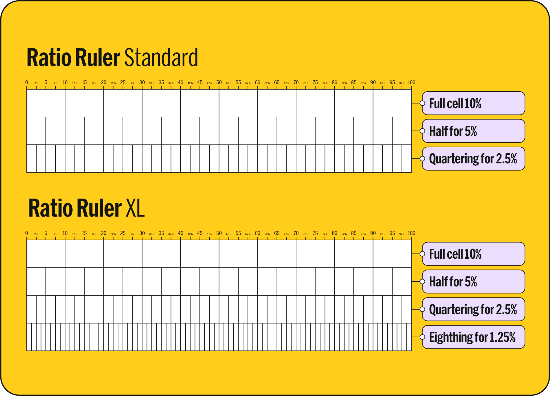
Base Grid Construction: The Ratio Ruler starts as a rectangle, divided into 10 equal vertical sections, each accounting for 10% of the total colour space. This structured grid is the foundation for defining colour ratios in design projects.
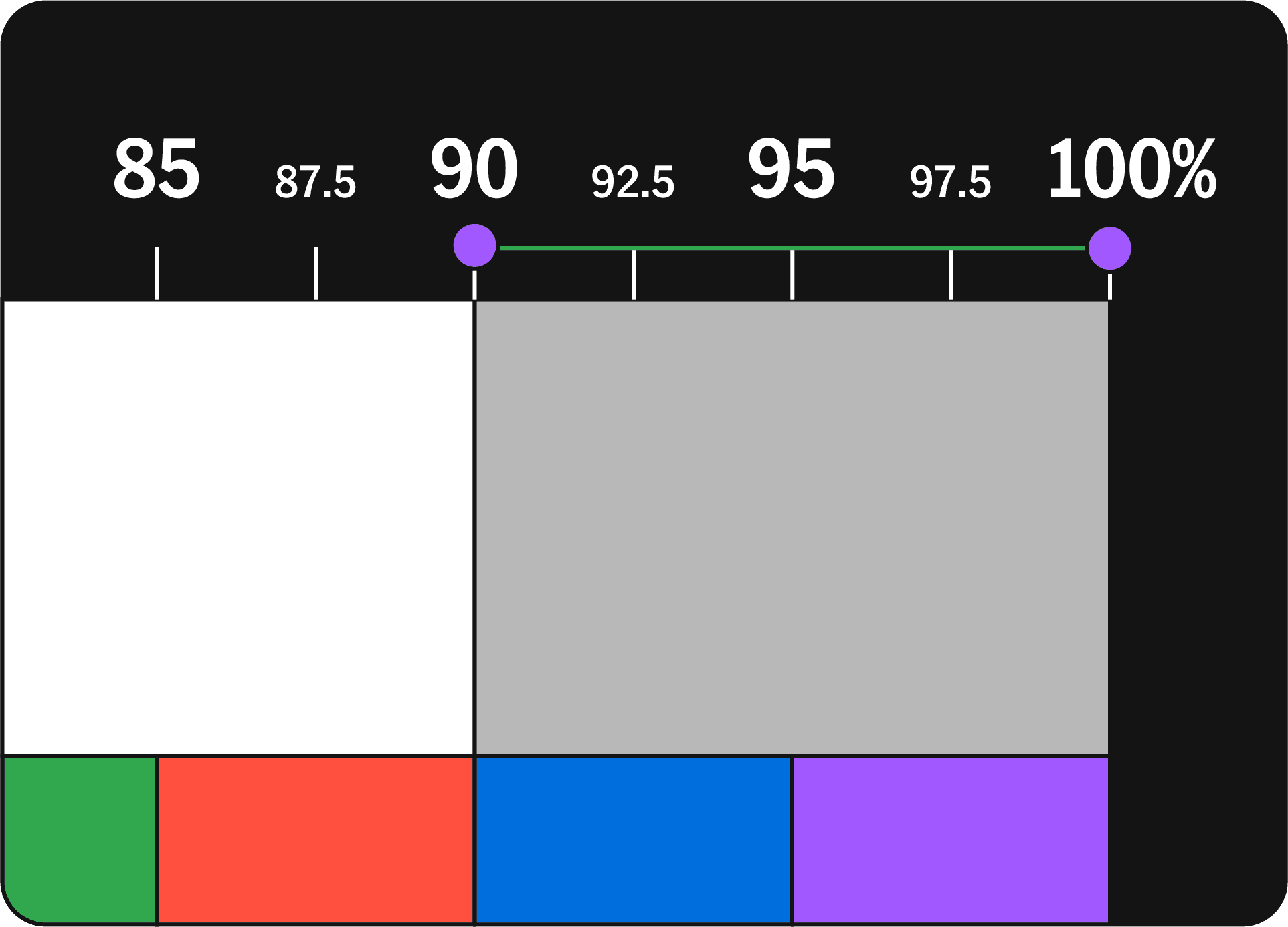
Vertical Subdivisions for Flexibility: The Ratio Ruler is designed for versatility, allowing for subdivisions into full (10%), half (5%), and quarter (2.5%) divisions. While finer divisions into eighths (1.25%) are possible, it's usually better to work with these larger, more manageable sections. This approach acknowledges that in most design scenarios, minor variations have a minimal impact, making the use of full, half, and quarter divisions more efficient and user-friendly.
Colour Ratio Rows for Multiple Profiles: By sectioning the rectangle horizontally, the Ratio Ruler allows for the creation of multiple colour profiles simultaneously. Each row operates independently, facilitating the development of varied colour themes.
Standard vs. XL Ratio Ruler:
Each version is crafted to meet different design needs, offering flexibility in how designers approach their projects.
Standard Ratio Ruler: Ideal for most design tasks, this version simplifies the colour application process. It's designed for ease of use across a wide array of projects, ensuring a smooth workflow for effectively applying the principles of the Colour Onion System.
Ratio Ruler XL: When a project demands greater attention to detail and precision, the Ratio Ruler XL becomes essential. It's specifically for complex designs where subtleties are crucial, providing the precision necessary for tackling sophisticated design challenges.
Choosing the Right Tool: The decision between the Standard and XL versions depends on the specific requirements of your design project. For general design tasks, the Standard Ratio Ruler is the ideal companion, offering ease and efficiency. In contrast, the Ratio Ruler XL is the go-to for intricate projects where every detail counts, delivering the enhanced capabilities required for achieving the highest level of detail and precision.
Conceptualizing Design Profiles with the Ratio Ruler
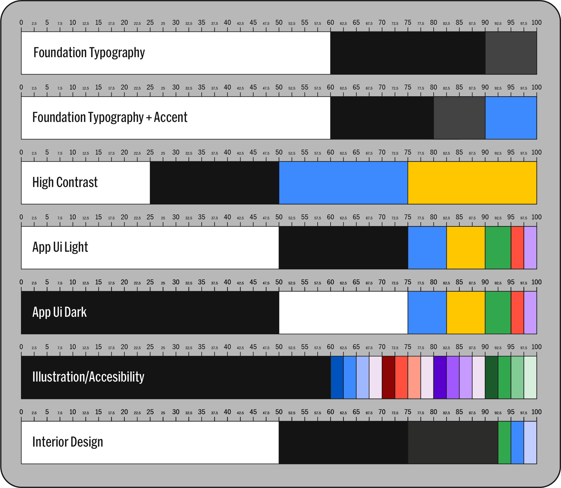
The Ratio Ruler’s versatility shines in its ability to inspire a range of design concepts across different disciplines, demonstrating how colour can be strategically utilized:
Typography Profile: Focuses on the interplay of text and background. This profile uses either neutral or coloured backgrounds, paired with high-contrast text colours, effectively applying figure-ground principles and shades for optimal readability and visual impact.
Complementary + Accent: This profile is all about harmony. Two complementary shades could dominate the scene, punctuated by a striking accent colour.
High Contrast: Designed for designs that demand attention, this profile features a bold split of colours, with one shade slightly more dominant, providing a striking visual 'pop'.
Mobile App UI (Light/Dark Mode): Carefully balances background shades for light or dark UI themes, ensuring clarity, user-friendliness, and aesthetic appeal.
Illustration: Enables the creation of diverse palettes that bring depth, character, and vibrancy to artworks, enhancing their storytelling and visual allure.
Accessibility: Prioritizes colour choices that ensure clarity and discernibility, marrying aesthetic beauty with functional design to accommodate a wide range of users.
Interior Design: Guides the development of colour schemes that create desired moods and atmospheres in interior spaces, from calming and cohesive to dynamic and expressive.
The Ratio Grid: Structuring Design with Precision
In the Colour Onion System, while the Ratio Ruler is about defining colour proportions, the Ratio Grid offers a precise spatial representation of these colours within a design canvas.
Constructing the Ratio Grid
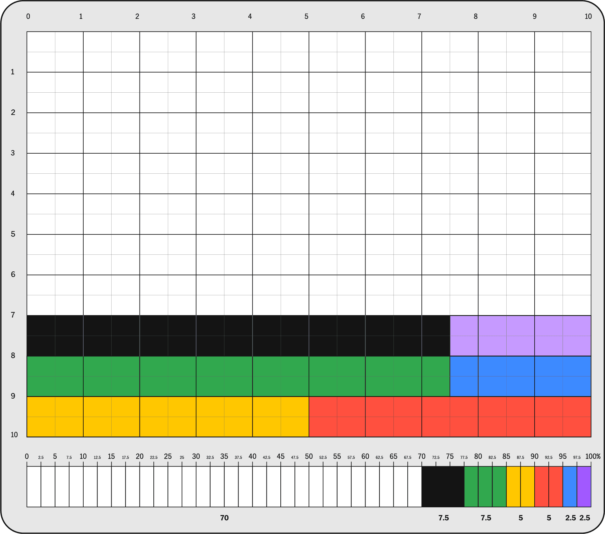
Visualising a 10x10 Matrix: The Ratio Grid is envisioned as a meticulously crafted 10x10 matrix on a design canvas. This structure results in 100 distinct units, with each unit corresponding to 1% of the total canvas area. By counting 10 cells in either direction, designers can cover 10% of the canvas, allowing for a detailed and tangible representation of colour percentages.
Application Across Design Dimensions: This carefully designed grid is applicable across various design dimensions, from graphic design to interior layouts, providing a universal tool for precise colour mapping.
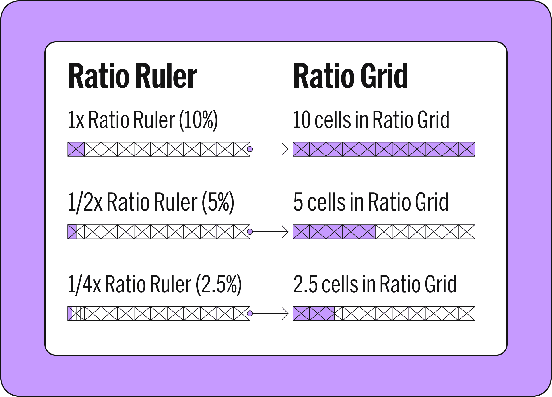
Translation from Ratio Ruler to Ratio Grid:
10% on the Ruler: Matches a full row or column in the Grid, filling 10% of your design space.
5% on the Ruler: Aligns with half a row or column, equalling 5 cells for a clear 5% colour representation.
2.5% on the Ruler: Converts to 2 and a half cells in the Grid, allowing precise 2.5% colour placement.
This direct correlation between the Ruler's sections and the Grid's structure simplifies colour planning, ensuring designs are balanced and visually appealing.
Introduction to the Grid Snapshot Feature
This clever tool simplifies colour analysis in visuals by layering a transparent grid over them. It's like putting on special glasses that instantly reveal which colours are used and how much of each.
Pros: Ideal for straightforward designs, providing an approximation of colour percentages for quick reference.
Cons: Struggles a bit with complex images where colours merge or patterns become highly detailed.
What's Next: We're building an app to do all this automatically. It'll analyse colours on the fly, save your favourite schemes for easy reuse, and even let you share them with others. Colour analysis is about to get even smarter.
Foundation for Future Projects
The Grid Snapshot and Ratio Ruler collaboration not only serves as pivotal references in design but also promotes a culture of sharing and innovation. These tools empower designers to document, reproduce, and refine colour profiles, assuring consistency while also accommodating creativity. They are instrumental in building a shared language of colour, enhancing both the coherence and the emotional impact of design projects.
The Ratio Ruler: Measuring Harmony in Design
The Colour Onion System's Ratio Ruler makes balancing colours easy and intuitive. This structured grid format provides designers with a clear visual method to allocate percentages, enabling them to modify, experiment, and create bespoke colour profiles. Such adaptability ensures that every design is not only systematic but also exudes inventive creativity.
Construction of the Ratio Ruler:
Base Grid Construction: The Ratio Ruler starts as a rectangle, divided into 10 equal vertical sections, each accounting for 10% of the total colour space. This structured grid is the foundation for defining colour ratios in design projects.
Vertical Subdivisions for Flexibility: The Ratio Ruler is designed for versatility, allowing for subdivisions into full (10%), half (5%), and quarter (2.5%) divisions. While finer divisions into eighths (1.25%) are possible, it's usually better to work with these larger, more manageable sections. This approach acknowledges that in most design scenarios, minor variations have a minimal impact, making the use of full, half, and quarter divisions more efficient and user-friendly.
Colour Ratio Rows for Multiple Profiles: By sectioning the rectangle horizontally, the Ratio Ruler allows for the creation of multiple colour profiles simultaneously. Each row operates independently, facilitating the development of varied colour themes.
Standard vs. XL Ratio Ruler:
Each version is crafted to meet different design needs, offering flexibility in how designers approach their projects.
Standard Ratio Ruler: Ideal for most design tasks, this version simplifies the colour application process. It's designed for ease of use across a wide array of projects, ensuring a smooth workflow for effectively applying the principles of the Colour Onion System.
Ratio Ruler XL: When a project demands greater attention to detail and precision, the Ratio Ruler XL becomes essential. It's specifically for complex designs where subtleties are crucial, providing the precision necessary for tackling sophisticated design challenges.
Choosing the Right Tool: The decision between the Standard and XL versions depends on the specific requirements of your design project. For general design tasks, the Standard Ratio Ruler is the ideal companion, offering ease and efficiency. In contrast, the Ratio Ruler XL is the go-to for intricate projects where every detail counts, delivering the enhanced capabilities required for achieving the highest level of detail and precision.
Conceptualizing Design Profiles with the Ratio Ruler
The Ratio Ruler’s versatility shines in its ability to inspire a range of design concepts across different disciplines, demonstrating how colour can be strategically utilized:
Typography Profile: Focuses on the interplay of text and background. This profile uses either neutral or coloured backgrounds, paired with high-contrast text colours, effectively applying figure-ground principles and shades for optimal readability and visual impact.
Complementary + Accent: This profile is all about harmony. Two complementary shades could dominate the scene, punctuated by a striking accent colour.
High Contrast: Designed for designs that demand attention, this profile features a bold split of colours, with one shade slightly more dominant, providing a striking visual 'pop'.
Mobile App UI (Light/Dark Mode): Carefully balances background shades for light or dark UI themes, ensuring clarity, user-friendliness, and aesthetic appeal.
Illustration: Enables the creation of diverse palettes that bring depth, character, and vibrancy to artworks, enhancing their storytelling and visual allure.
Accessibility: Prioritizes colour choices that ensure clarity and discernibility, marrying aesthetic beauty with functional design to accommodate a wide range of users.
Interior Design: Guides the development of colour schemes that create desired moods and atmospheres in interior spaces, from calming and cohesive to dynamic and expressive.
The Ratio Grid: Structuring Design with Precision
In the Colour Onion System, while the Ratio Ruler is about defining colour proportions, the Ratio Grid offers a precise spatial representation of these colours within a design canvas.
Constructing the Ratio Grid
Visualising a 10x10 Matrix: The Ratio Grid is envisioned as a meticulously crafted 10x10 matrix on a design canvas. This structure results in 100 distinct units, with each unit corresponding to 1% of the total canvas area. By counting 10 cells in either direction, designers can cover 10% of the canvas, allowing for a detailed and tangible representation of colour percentages.
Application Across Design Dimensions: This carefully designed grid is applicable across various design dimensions, from graphic design to interior layouts, providing a universal tool for precise colour mapping.
Translation from Ratio Ruler to Ratio Grid:
10% on the Ruler: Matches a full row or column in the Grid, filling 10% of your design space.
5% on the Ruler: Aligns with half a row or column, equalling 5 cells for a clear 5% colour representation.
2.5% on the Ruler: Converts to 2 and a half cells in the Grid, allowing precise 2.5% colour placement.
This direct correlation between the Ruler's sections and the Grid's structure simplifies colour planning, ensuring designs are balanced and visually appealing.
Introduction to the Grid Snapshot Feature
This clever tool simplifies colour analysis in visuals by layering a transparent grid over them. It's like putting on special glasses that instantly reveal which colours are used and how much of each.
Pros: Ideal for straightforward designs, providing an approximation of colour percentages for quick reference.
Cons: Struggles a bit with complex images where colours merge or patterns become highly detailed.
What's Next: We're building an app to do all this automatically. It'll analyse colours on the fly, save your favourite schemes for easy reuse, and even let you share them with others. Colour analysis is about to get even smarter.
Foundation for Future Projects
The Grid Snapshot and Ratio Ruler collaboration not only serves as pivotal references in design but also promotes a culture of sharing and innovation. These tools empower designers to document, reproduce, and refine colour profiles, assuring consistency while also accommodating creativity. They are instrumental in building a shared language of colour, enhancing both the coherence and the emotional impact of design projects.
In Part 4, we've examined the Ratio Ruler and Ratio Grid, key tools of the Colour Onion System that bring precision to design. These tools showcase the practicality of C.O.S in achieving detailed colour harmony. Next, in Part 5, we'll explore how these tools are applied in real-world design projects. From branding to UI design, we'll highlight their effectiveness through a case study of the C.O.S event’s visual identity, demonstrating C.O.S's role in creating impactful designs.
In Part 4, we've examined the Ratio Ruler and Ratio Grid, key tools of the Colour Onion System that bring precision to design. These tools showcase the practicality of C.O.S in achieving detailed colour harmony. Next, in Part 5, we'll explore how these tools are applied in real-world design projects. From branding to UI design, we'll highlight their effectiveness through a case study of the C.O.S event’s visual identity, demonstrating C.O.S's role in creating impactful designs.
In Part 4, we've examined the Ratio Ruler and Ratio Grid, key tools of the Colour Onion System that bring precision to design. These tools showcase the practicality of C.O.S in achieving detailed colour harmony. Next, in Part 5, we'll explore how these tools are applied in real-world design projects. From branding to UI design, we'll highlight their effectiveness through a case study of the C.O.S event’s visual identity, demonstrating C.O.S's role in creating impactful designs.